Nostalgic Cinema: Breaking Dreams
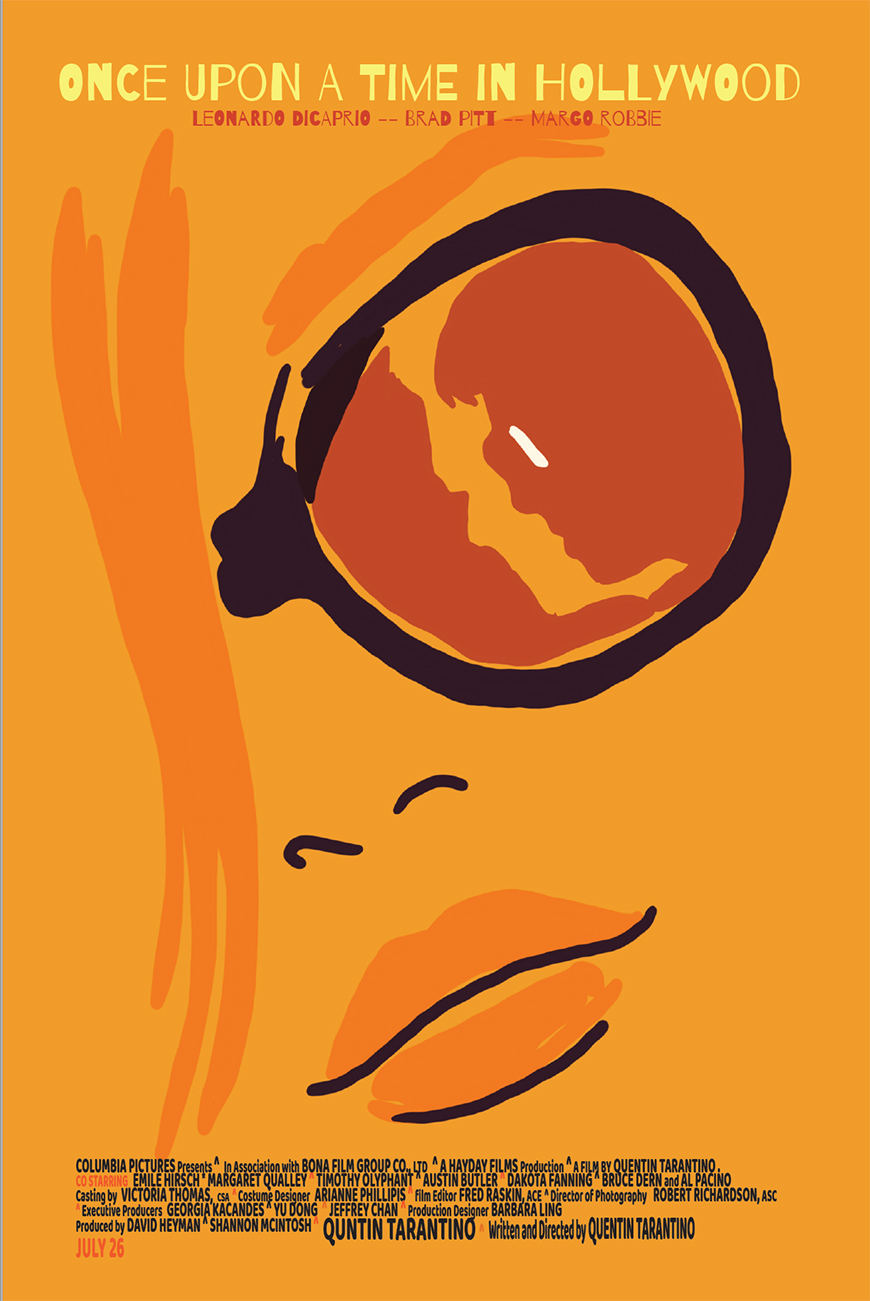
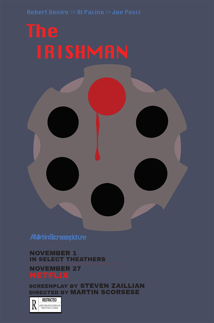
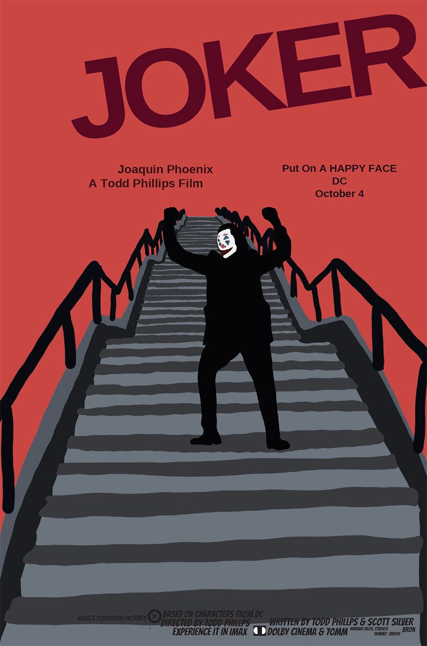
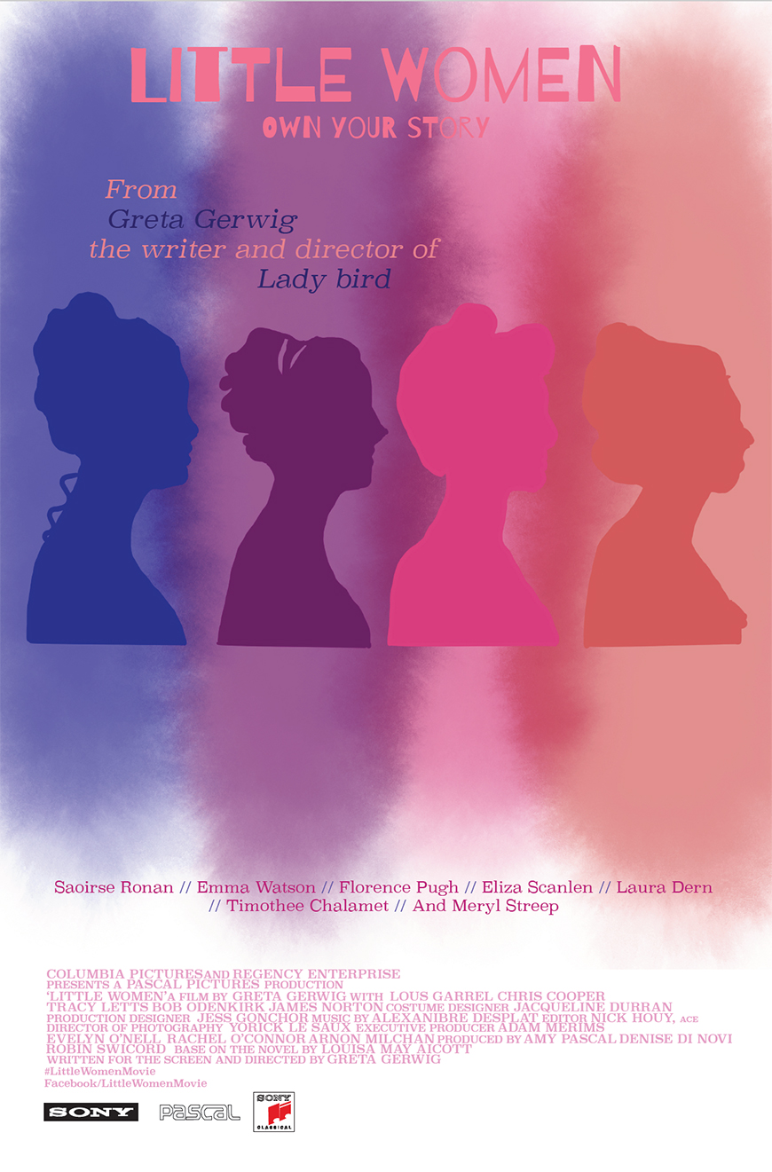
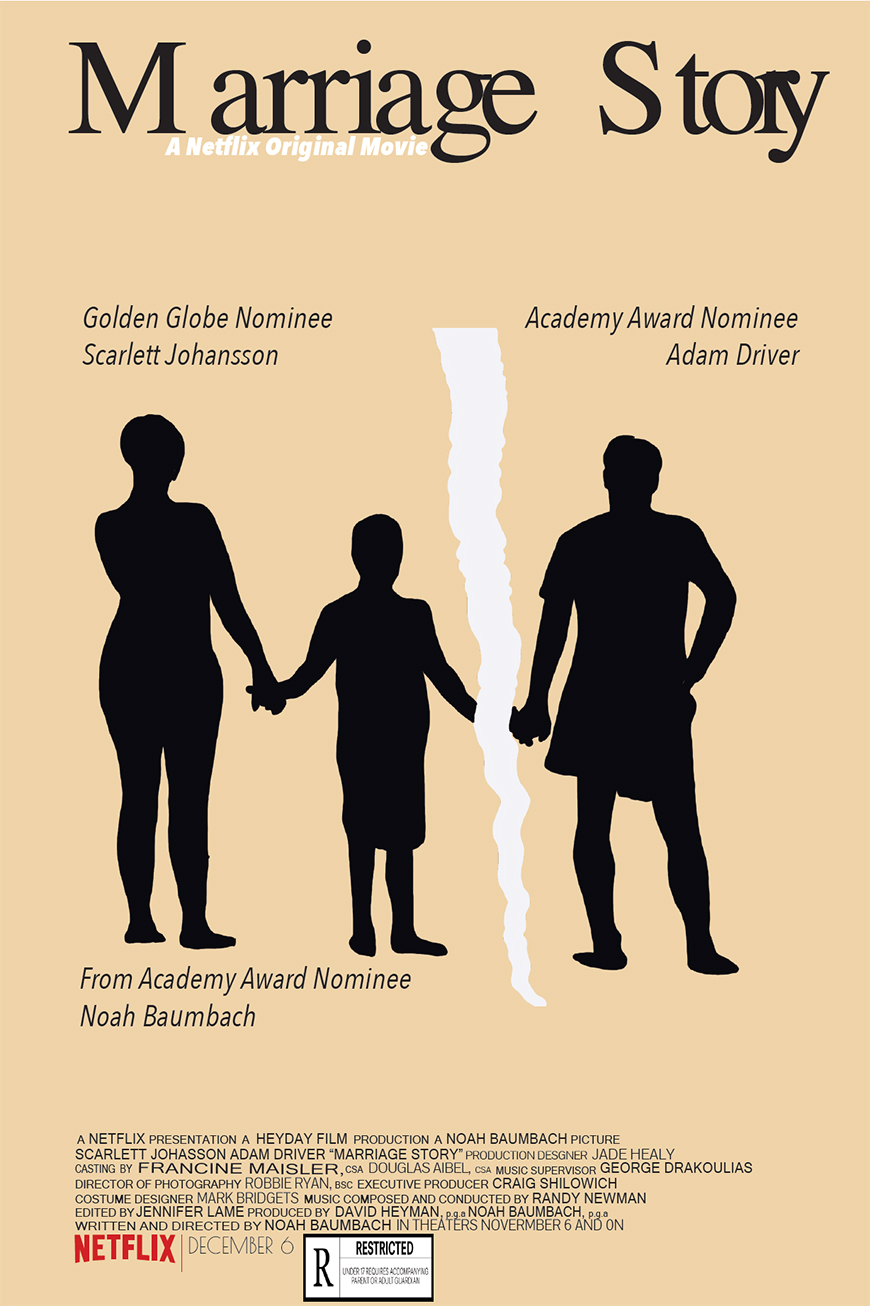
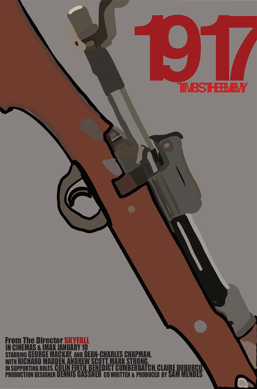
This work that you are looking at is a concept that start back in time and then when forward in time. The original idea was to take older movie posters and make them modern. Then it changed in to take modern movie posters and making them in the style of the 1940’s. The 1940’s posters are illustrated, the use of one color/or similar colors, and the design aspect that is a bit mess and cluttered. These posts did keep a few modern details. Like the information on the bottom and the ratings. The title reflects the change from modern to 1940’s style. Saying that since these are supposed to be nostalgic but there is a modern twisted in them. I decided to focus on movie poster because I really enjoy movies and the advertisement of the movies. That is another thing that I want to possibly get into is work on movies and movie posters. These where created using Adobe illustrator. They start off as sketches and then became the work you are looking at. This took a few hours of planning and research to make sure that every detail of the style fit but was not to overpowering. Then it took more time to plan mood board to get the most authentic vintage colors and write as possible. The last parts of the process took the longest because that was the assembly of the everything in Illustrator as well as illustrating the imaged in the background of the poster to give it more structure.
Once Upon a Time in Hollywood
- MediumPoster DesignSize24"x36"
- MediumPoster Design
- Size24"x36"
- MediumPoster Design
- Size24"x36"
- MediumMovie Poster
- Size24"x36"
- MediumMovie Poster
- Size24"x36"
- MediumMovie Poster
- Size24"x36"
- MediumDigital Drawing
- Size1000px x 180px
- MediumDigital Drawing
- Size3024px x 4022 px
- MediumDigital Drawing
- Size2048px x 2048px

